Log-normal fitting and Q-Q plots in R
This week I had the pleasure of fitting a log-normal distribution to some pretty big data. Since I already had code to read in the data in R, that’s what I used to do the fit. A bit of googling predictably threw up about twenty different ways of doing it, in an array of different packages, so I tried and tested a few but found that many didn’t handle the size of my data very well, and none of them allowed me to generate Q-Q plots, most just hanging and crashing my session.
So, I coded it up by hand. The Gist at the bottom of the page generates some random data, adds a bit of noise, then fits a log-normal using the fitdistr function from the MASS package. MASS has been around for almost 15 years now, from back when R was S, and has a ton of well tested functions that a whole bunch of other packages depend on. In other words, it’s legit. It then plots a histogram of the data against the fitted log-normal, generates quantiles for the fitted and original data, and plots them against each other in a Q-Q plot.
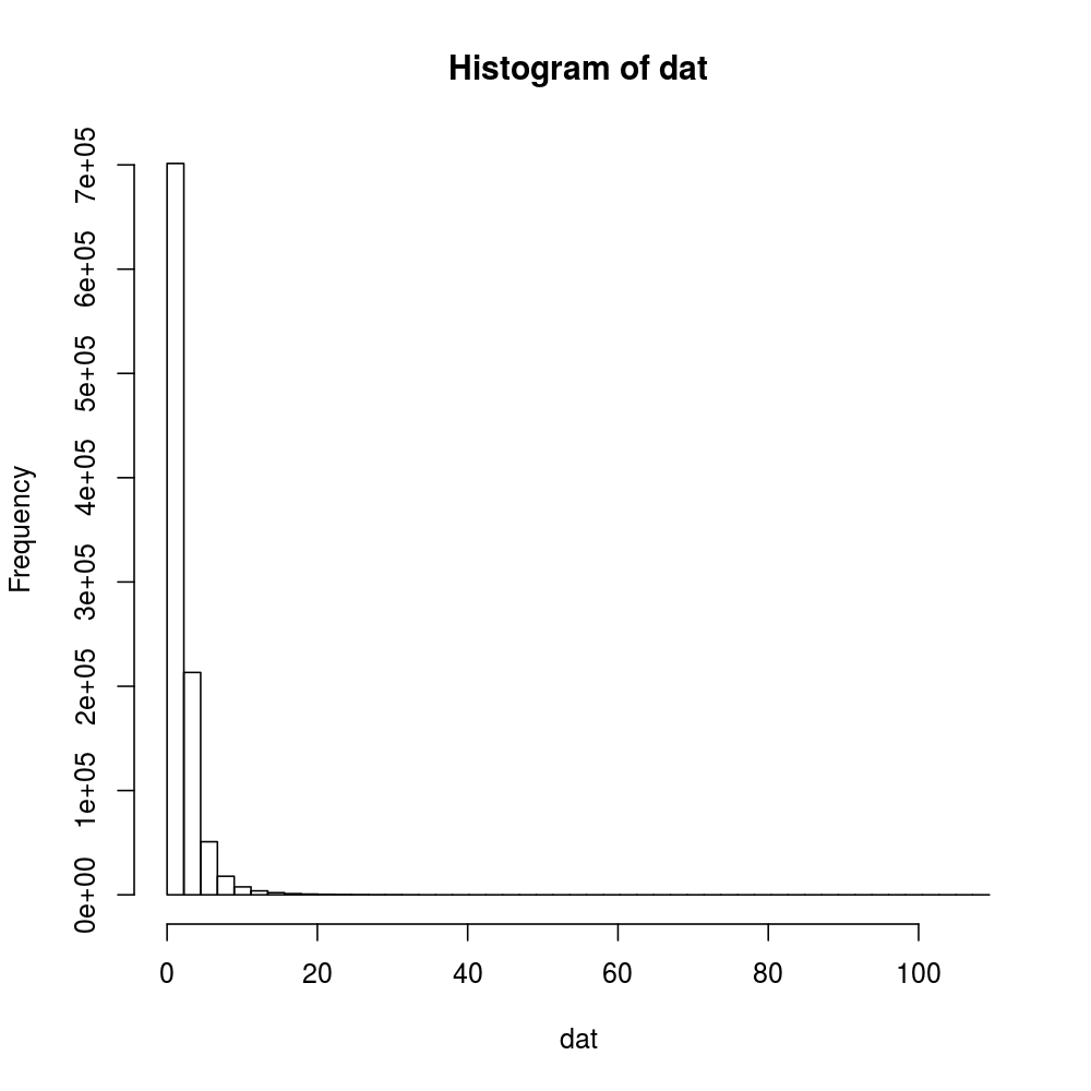
Here’s a histogram of the clean generated data with 50 breaks.
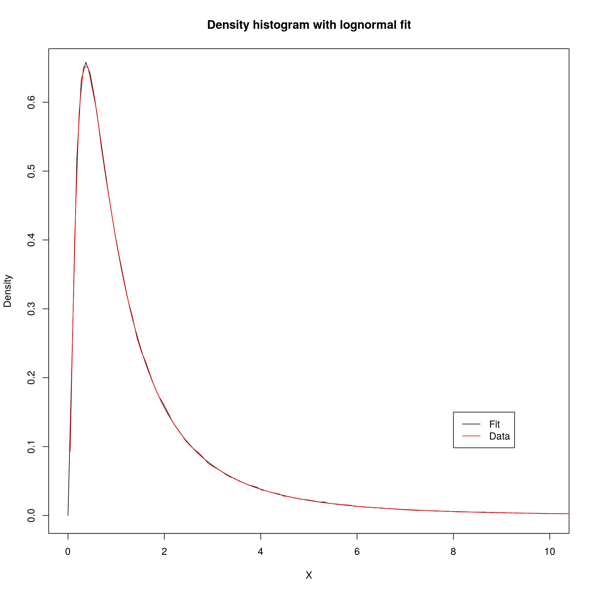
Here’s a line plot of the same histogram with a higher number of breaks, alongside the fit.
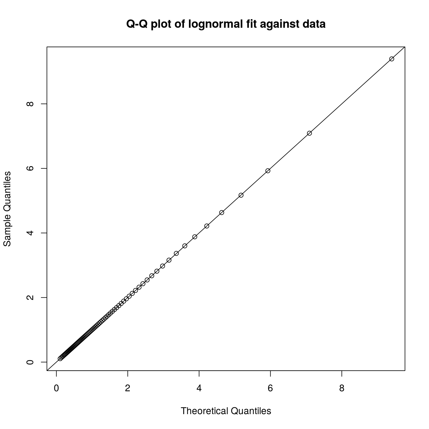
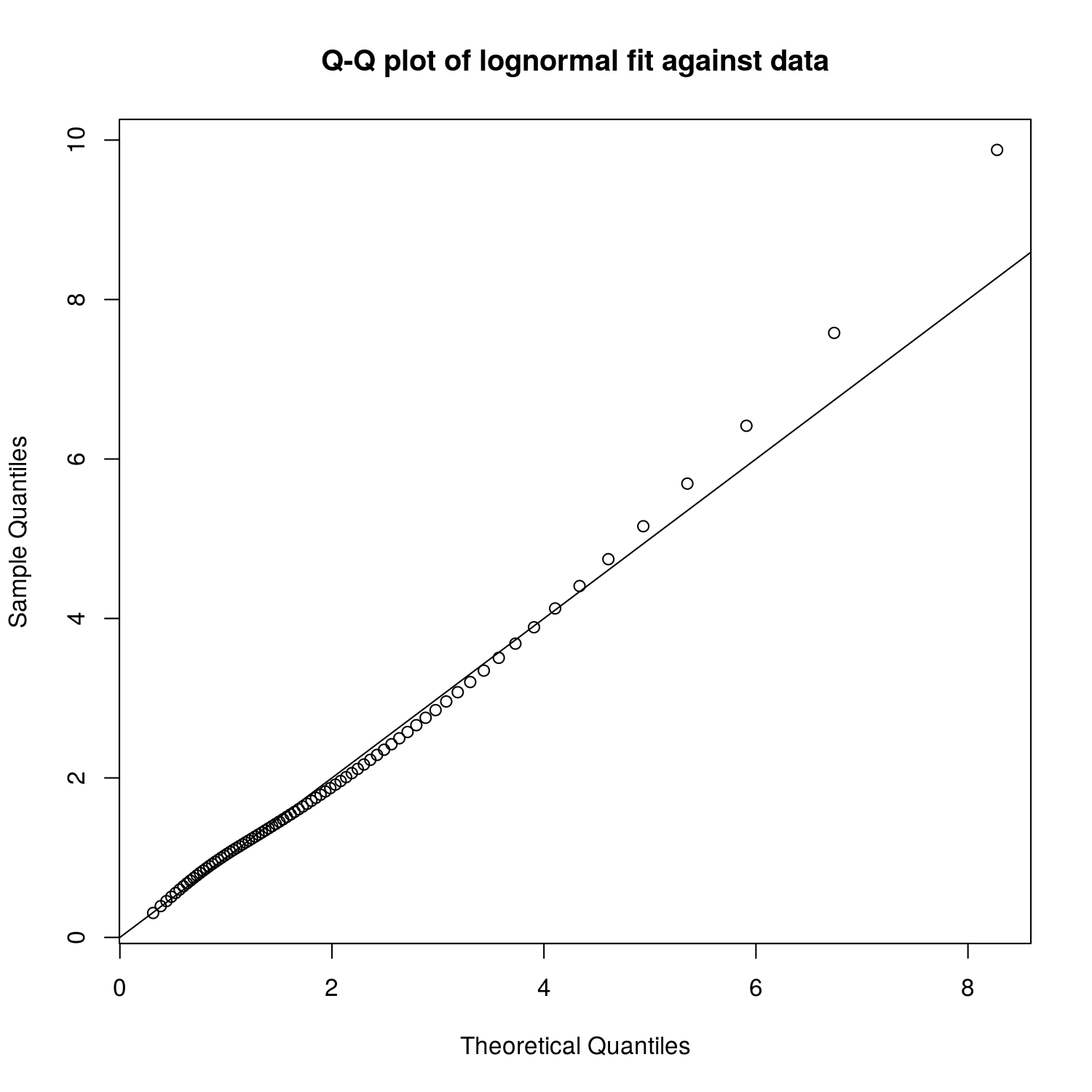
And the Q-Q plot.
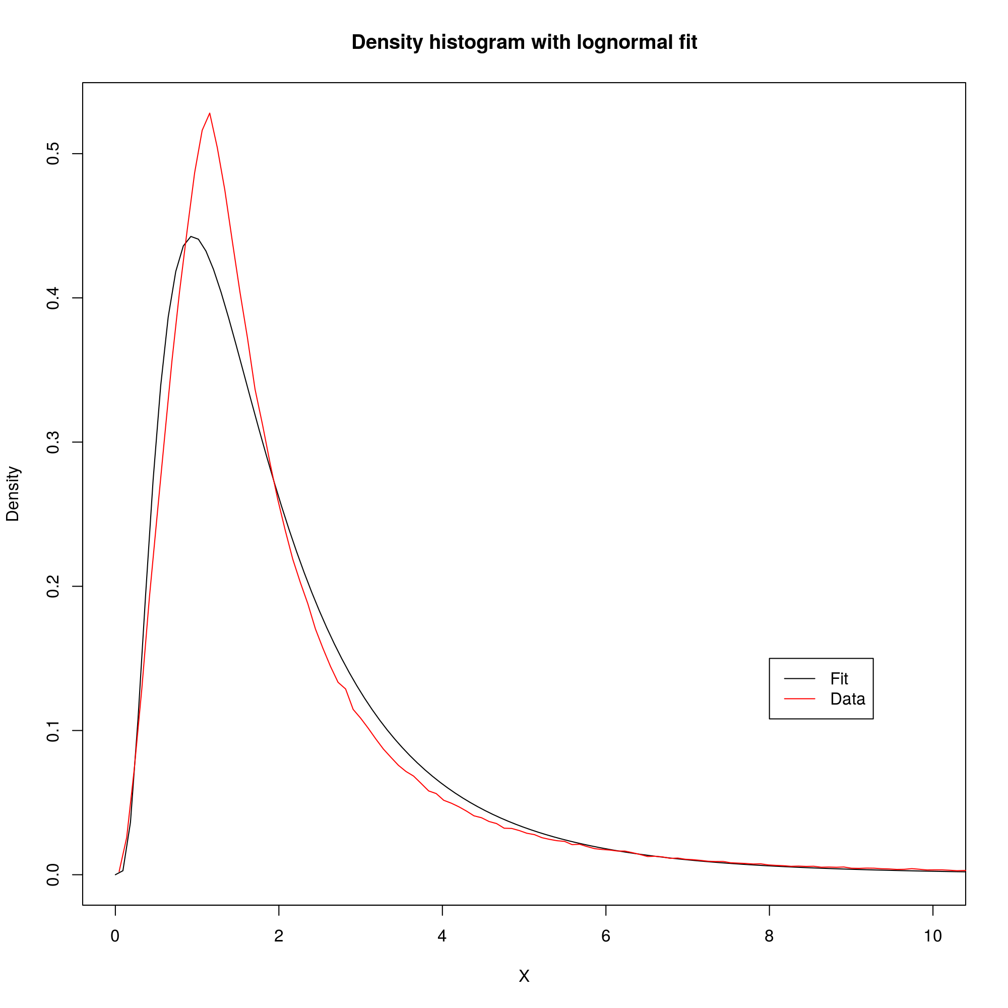
The fit with the noise is visibly off around the peak.
The Q-Q plot shows that most of the difference is actually in the high value tail of the distribution.
Subscribe via RSS